Jenny Hytönen
We designed a logotype for Finnish fashion designer Jenny Hytönen, winner of the Hyères Festival’s Grand Prix. Balancing gothic elegance and sci-fi shimmer, the logo draws from the same world as her work: precise, romantic, and just a little dangerous.
Type Design
Niklas Ekholm
Niklas Ekholm
Branding Agency
–
–
Client
Jenny Hytönen
Jenny Hytönen
Photography
Courtesy of Jenny Hytönen
Courtesy of Jenny Hytönen
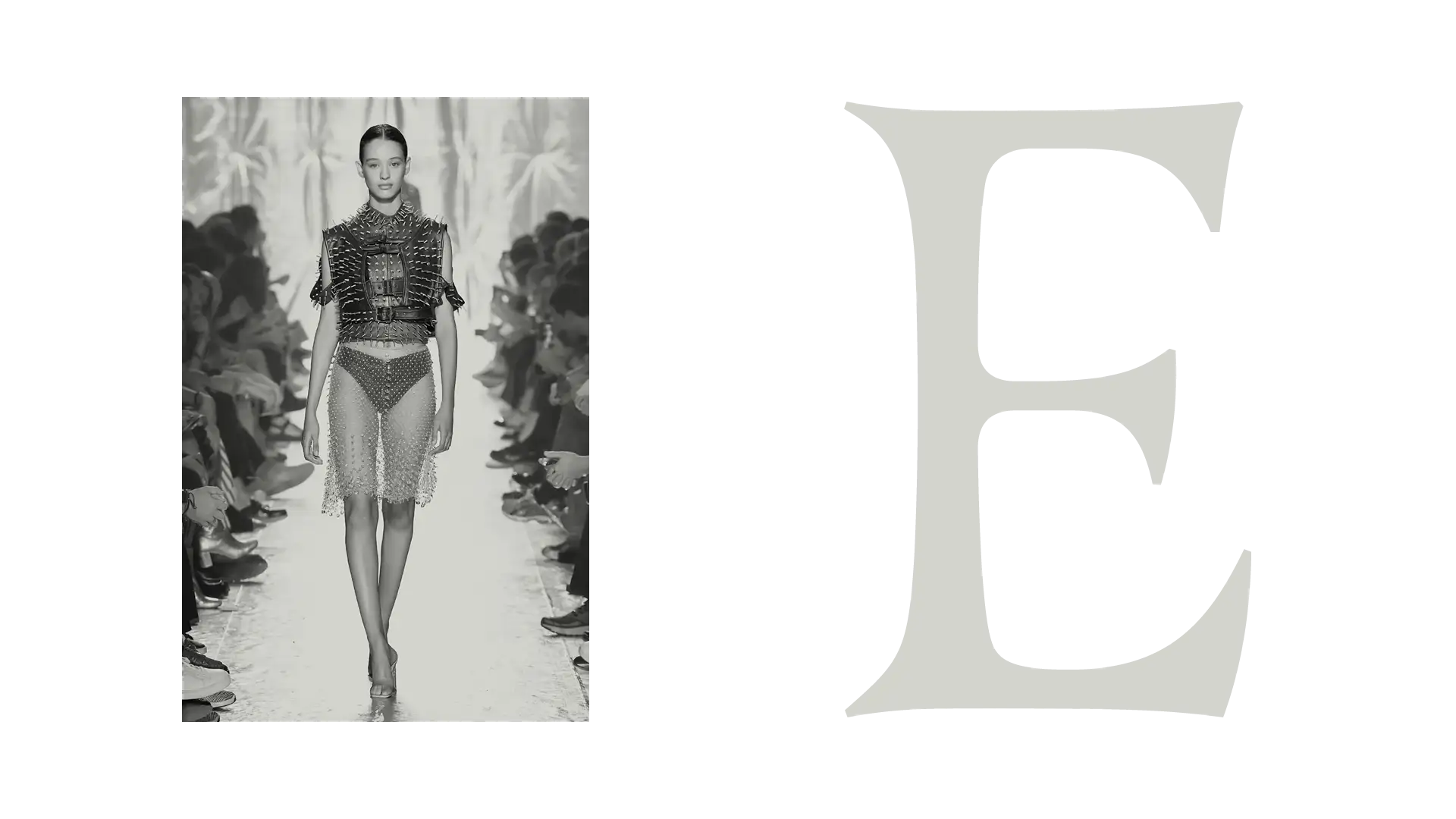
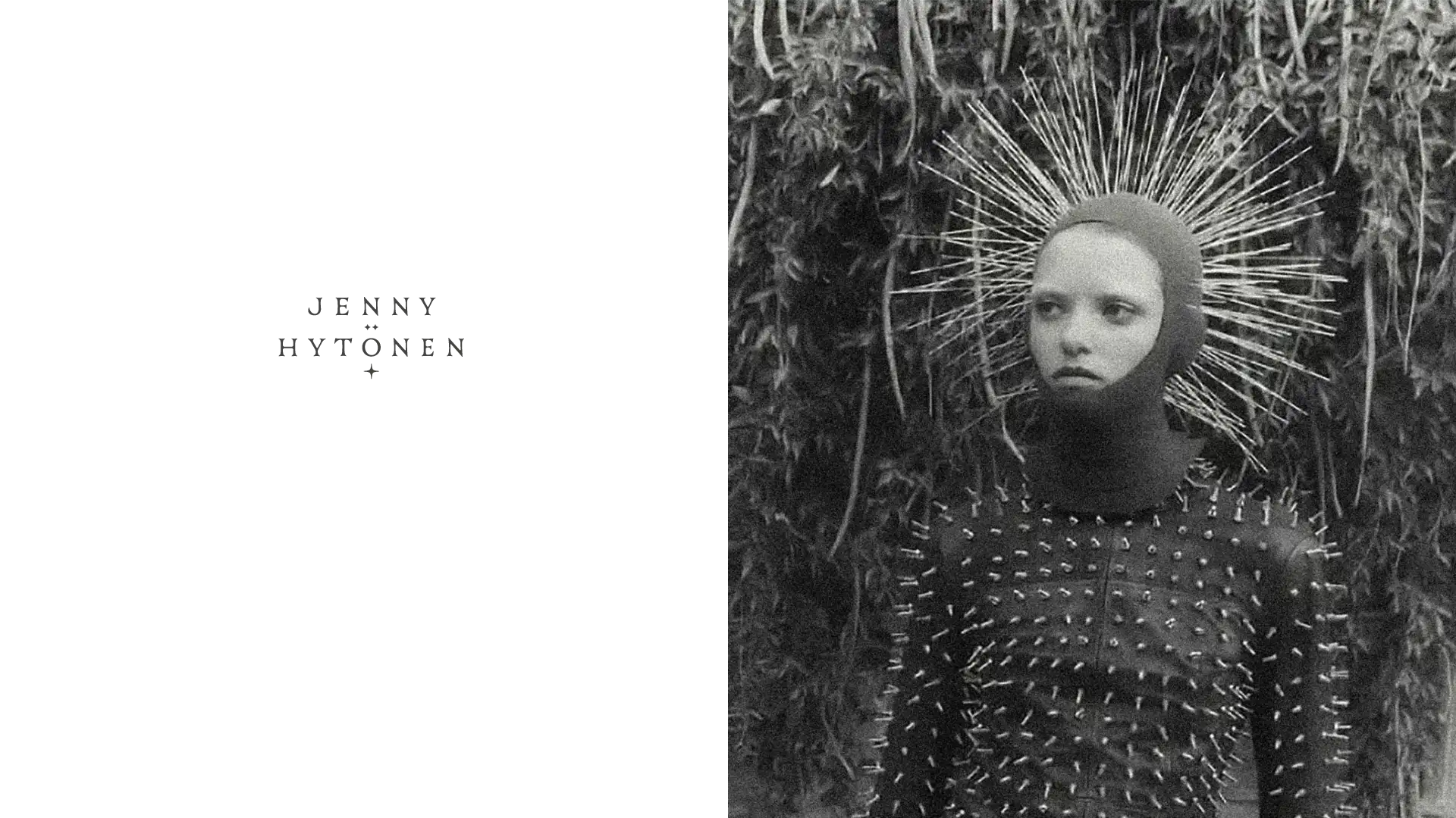
There’s a shared language between letterforms and clothing — both rely on silhouette, detail, and movement. For Jenny Hytönen, whose designs fuse delicate textures with sharp structural cuts, we aimed to translate that tension into typographic form. The logotype’s core structure nods to classical proportions, but nothing is left untouched: terminals are clipped, stems pinched, counters slightly warped. These tweaks are almost imperceptible at first glance, but they echo the precision of a hand-cut hem or embroidered edge. Just like in fashion, the effect emerges in motion, from context, in the way the logo sits on a page or moves across fabric. It’s gothic but not nostalgic, decorative but controlled — a silhouette with intent.
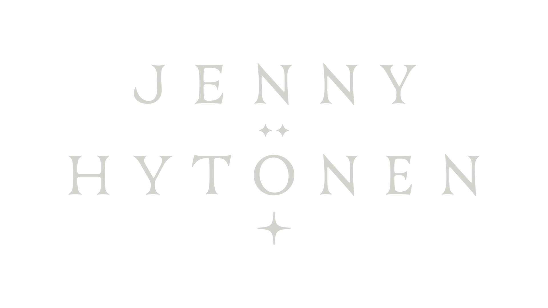
The final logotype spells out Jenny Hytönen in a confident, all-caps rhythm, with generous letterspacing that lets each form breathe. This wide stance gives it a quiet authority — not shouting, but clearly present. Every letter was drawn from scratch to balance the cool sharpness of high fashion with something softer and stranger. Nowhere is this clearer than in the dieresis over the “ö”, where the two dots have been redrawn into tiny starbursts. It’s a subtle but deliberate move, catching the light like a studded crystal or a pair of gleaming earrings. The stars hint at the fantastical side of Jenny’s world — the dream logic, the synthetic shimmer — and give the logotype its final note: something magical anchored in structure.