Off-White
We designed a custom typeface for Off-White™ — a refined evolution of the Bookish typeface, tailored for the brand’s distinctive aesthetic.
Type Design
Niklas Ekholm
Niklas Ekholm
Branding Agency
Studio Temp
Studio Temp
Client
Off-White
Off-White
Photography
Courtesy of Off-White
Courtesy of Off-White

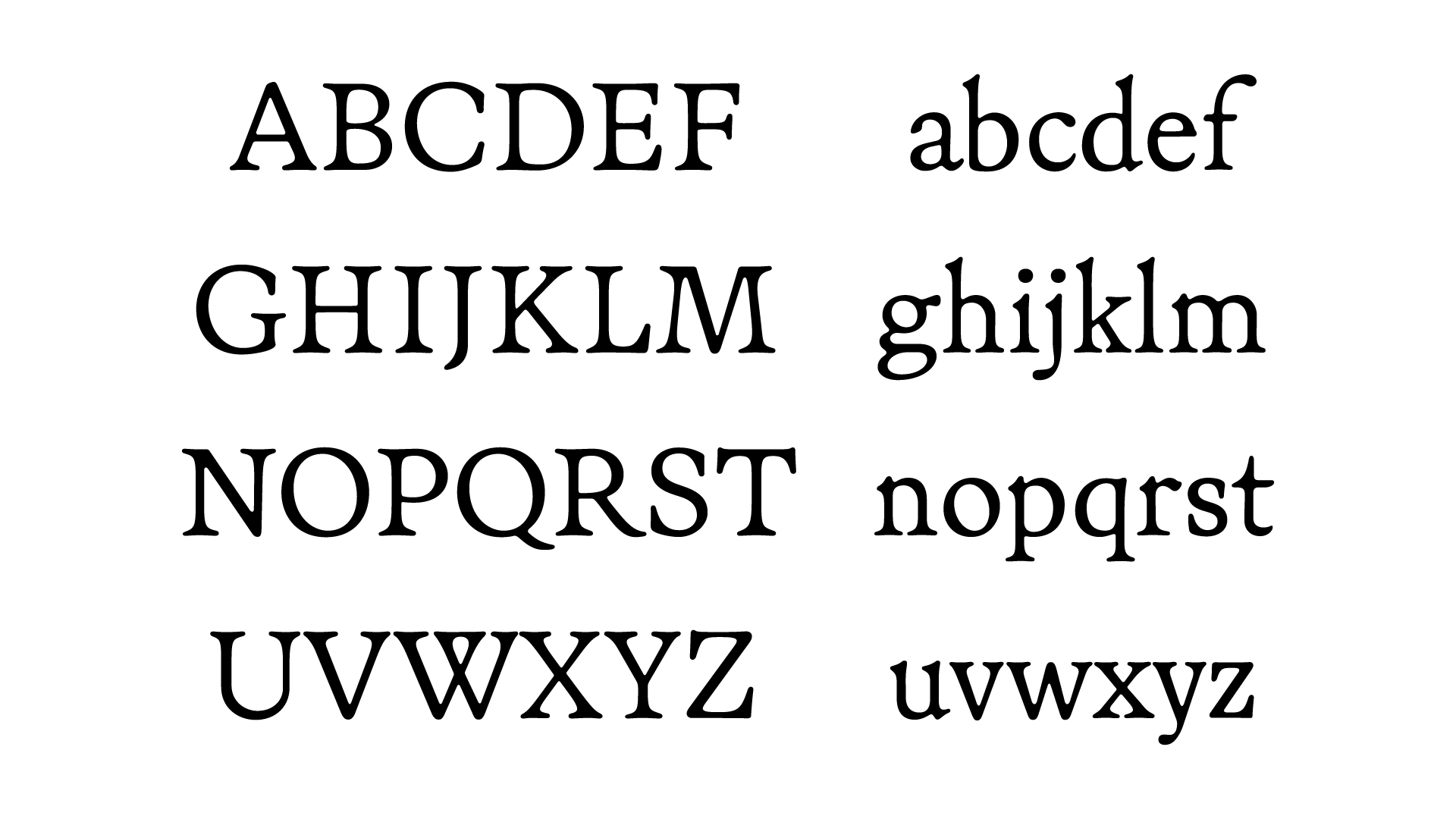
The Off-White™ typeface is a bespoke adaptation of our Bookish font, reimagined to resonate with the brand’s unique identity. While Bookish is known for its soft, traditionally crafted forms, this iteration introduces a more defined and regular structure. Drawing inspiration from renowned Renaissance antiqua typefaces, the design incorporates Italian influences, evident in the balanced proportions and subtle serif details. The result is a harmonious blend of classical elegance and contemporary clarity. Additionally, we’ve developed a new display version that amplifies these characteristics, ensuring versatility across various applications.


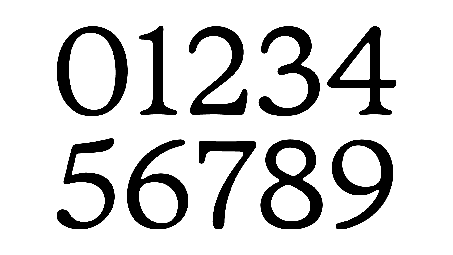
In this custom typeface, numerals have been meticulously redrawn to strike a balance between precision and subtle irregularity. Each digit maintains clarity while embracing slight deviations that add character and warmth. This approach reflects our belief that perfection in design often lies in the nuances—the shapes that are just a little off, yet feel inherently right. It’s this intentional imperfection that brings authenticity and a human touch to the typographic experience.

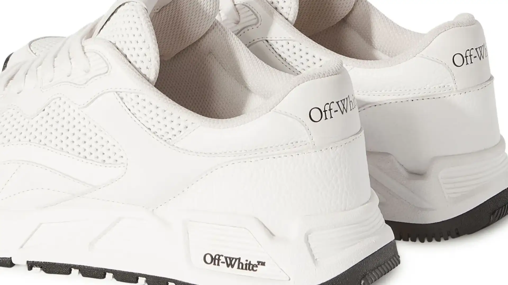
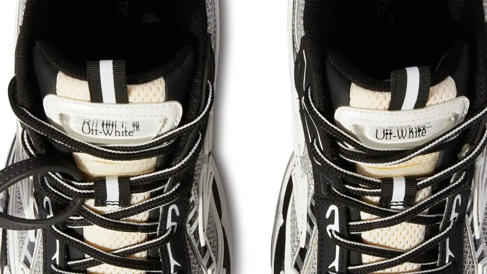
The rounded forms and balanced structure of the Off-White™ typeface make it exceptionally adaptable across various materials. Whether embossed on rubber soles, woven into fabric labels, or printed on packaging, the font maintains its integrity and legibility. Its design ensures that it not only complements the physical textures but also enhances the overall brand narrative. This versatility underscores our commitment to creating typefaces that are both aesthetically pleasing and functionally robust, seamlessly integrating into the diverse mediums of contemporary fashion branding.