Niklas Ekholm
When The Temporary Bookshelf, run by Hikari Nishida commissioned a typeface it was obvious this had to really be something else.
In the first text intended to be published using this font, Towards a self sustaining publishing model, Marc Fischer beckons the aspiring publisher to “carve something into a potato” for the sake of autonomy from professional printers.
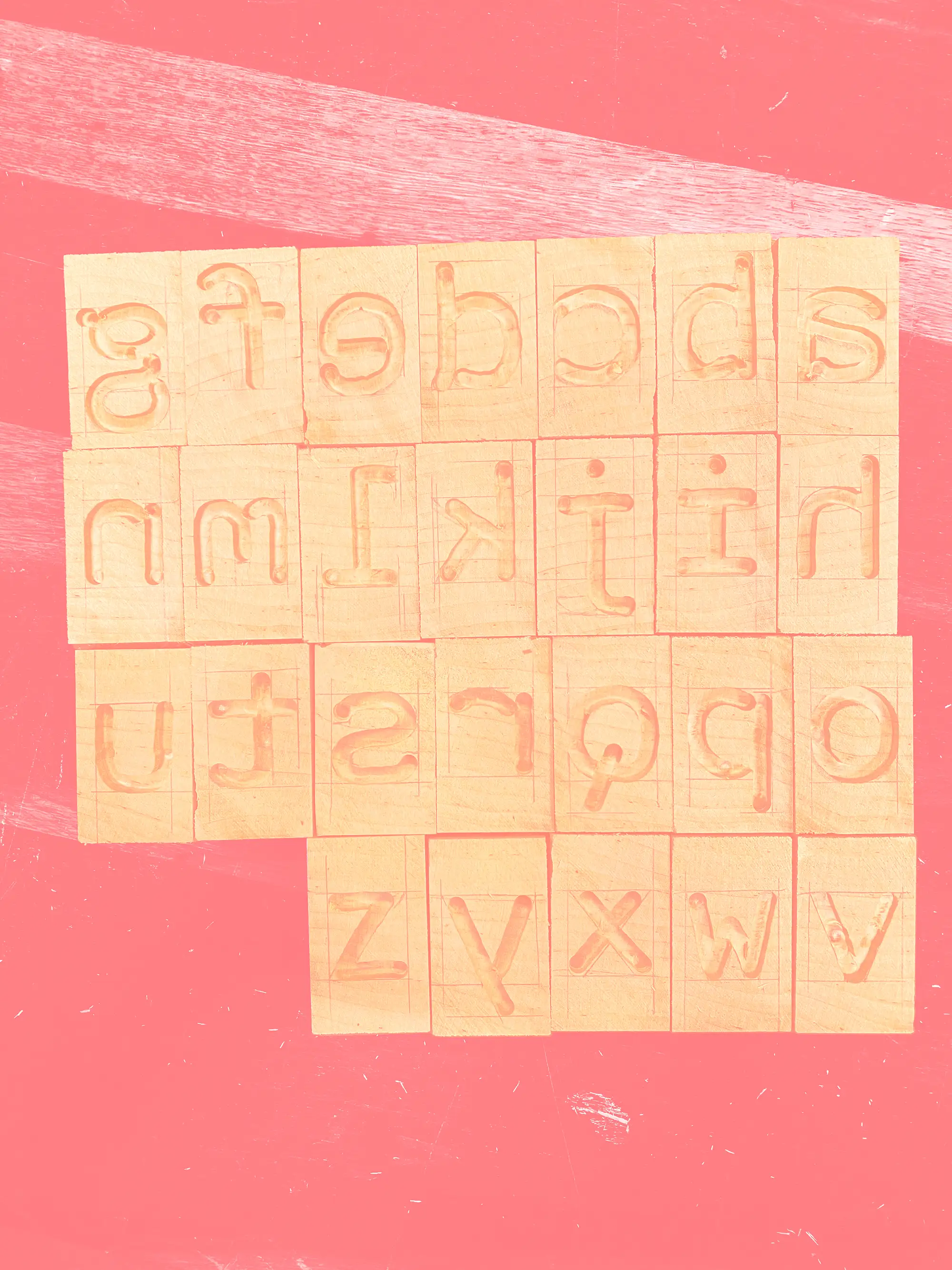
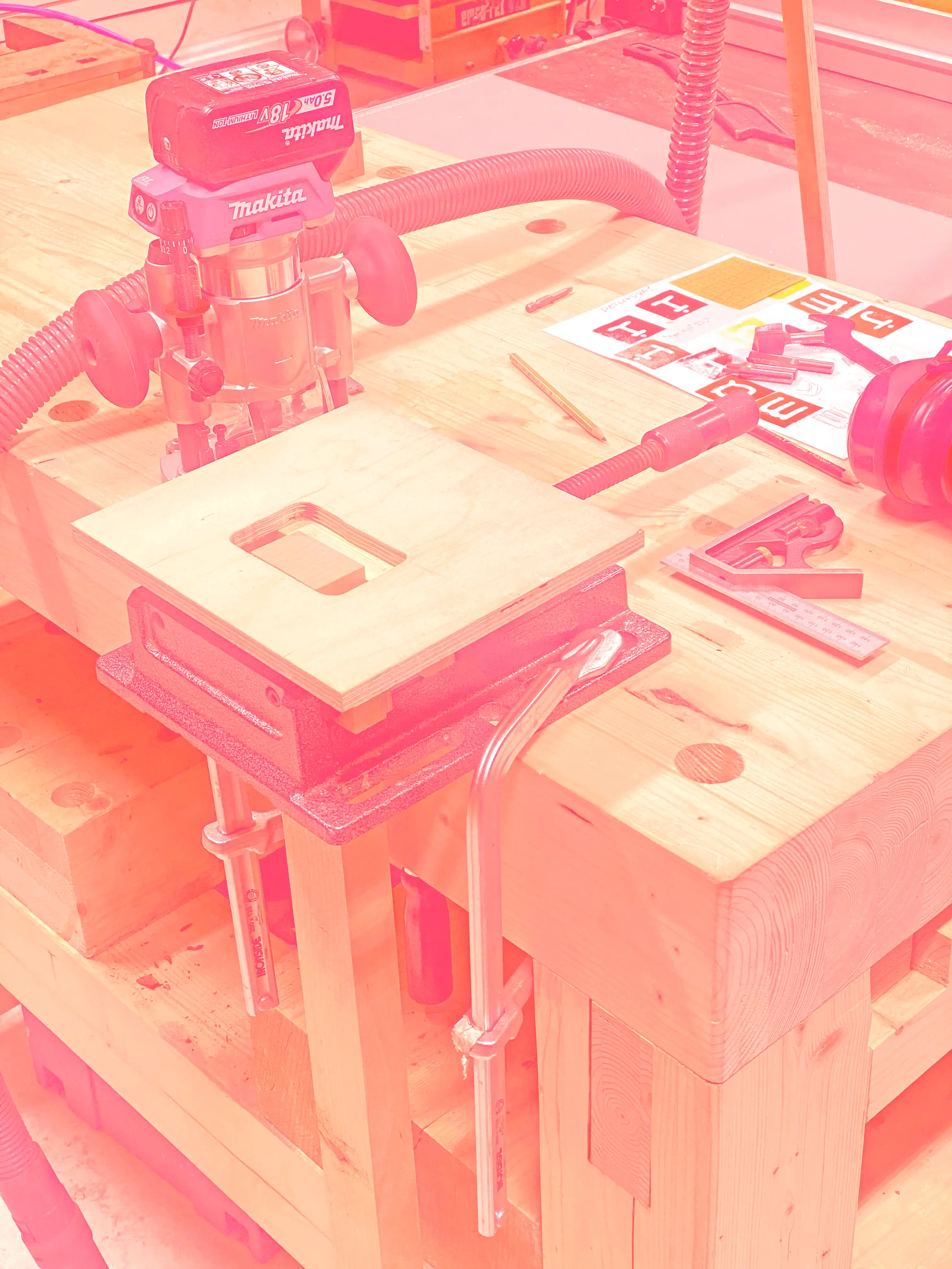
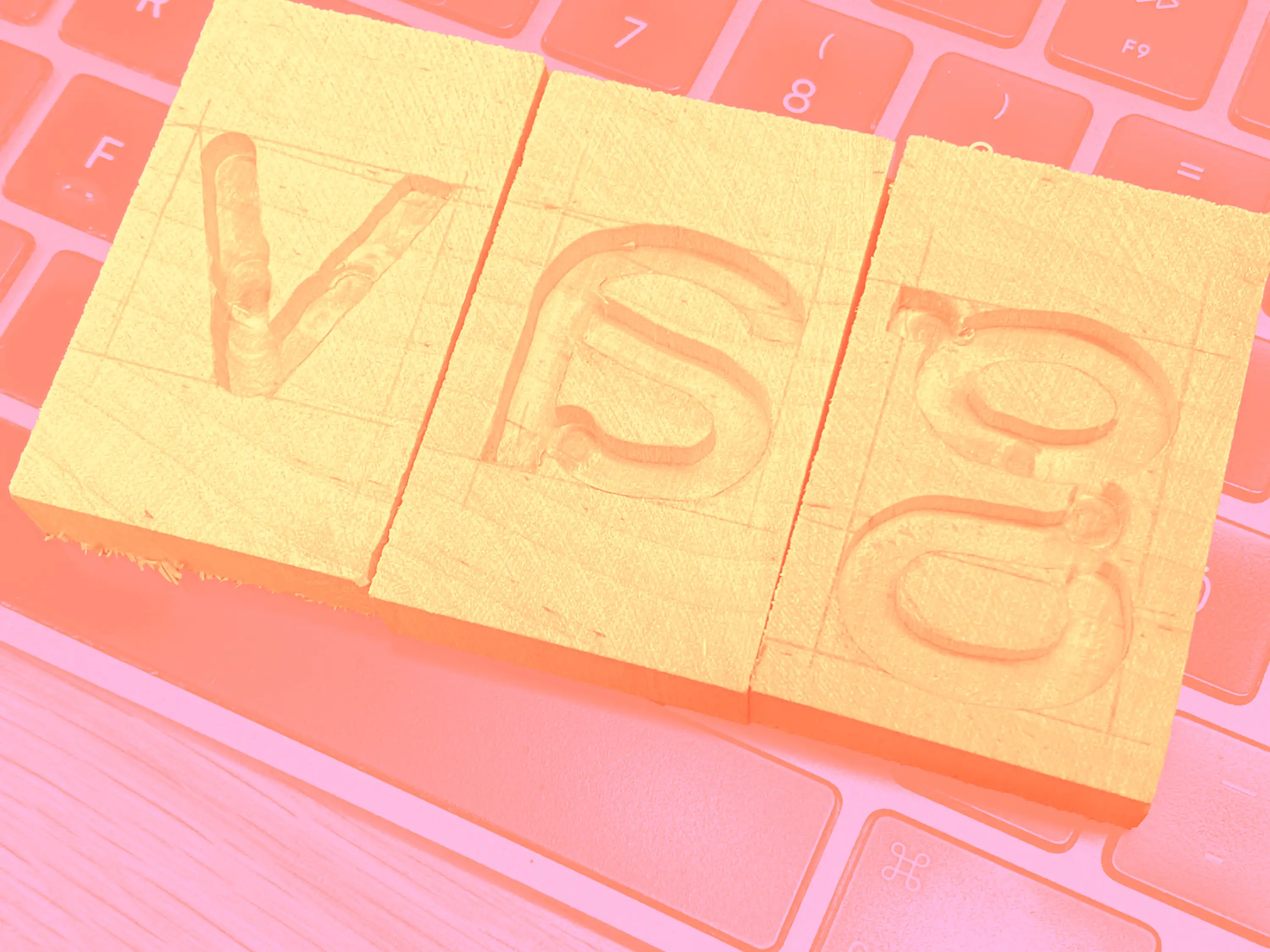
Encouraged by this pragmatic advice I set out to make something self-contained and easily usable: This was to become my first real font – not just an digital file, but a material object including the whole story of its birth in its molecular makeup. The birch tree used to grow in dad's backyard. Every tremor while holding the Makita DRT50 18v hand-held router an evidence of how many espressos I had that day. Countless hours spent painstakingly finishing the crudely cut blocks by carving sharp corners with an exacto knife still end up producing something far inferior to a CNC-milled counterpart — but who cares: it’s real, and we know where it came from.
While typeface design always moves in virtuality, and our imagination of hyper-specific micro-aesthetics usually runs amok, the vibrancy of material remains unsurpassable for me. But of course, it will be interpreted and gets its meaning from ! the use it is put to. The artifact as token of low-tech luxury. The expression of cultural literacy in identifying it. What a long way down from the pragmatic advice where it started. But what a joyous ride it was! In the production of a digital font, Lari Mörö was an invaluable help in his first weeks of internship at the studio. The usefulness of this wood block font will inevitably be eclipsed by its digitized reproductions and those further outshined by the mediated images of its context. This is as it should, and we hope the fonts will be useful.
Typeface: TTB Router Sans
Designers: Niklas Ekholm & Lari Mörö
Year: 2025